LABEL CREATION PROCESS
The illustrator would create several illustrations related to the new label's theme. After they were approved in-house, she would send over a high-res scan at 1000 dpi.
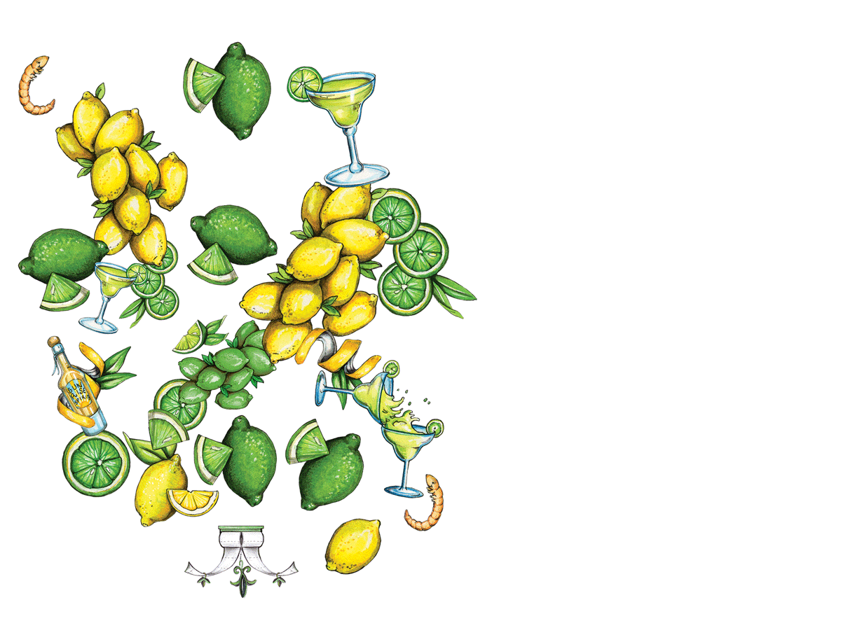
ORIGINAL SCANNED WATERCOLOR FILE

My first step was to duplicate the file, create a new background layer, flood it with "Poo" Blue, and use the brush eraser tool on the illustrated layer. This allowed me to clearly see what I was erasing and helped ensure there were no remnants left from the scanned layer.
The brush eraser was always set to 85% hardness (for a slightly soft edge.) The goal was to cut as close to each element as possible, leaving a thin black border around all edges. If part of an edge wasn't dark enough, I used the burn tool along the edge to darken it.
BEFORE

AFTER

CLIPPED-OUT ELEMENTS

After clipping out each element, they were put onto separate layers.
The next step was to combine all the different elements into what I called "the badge." That's the artwork you see on the front of Poo~Pourri bottles. While there are a million different ways the elements could be combined, I would usually only create 2-3 versions and let the creative director pick her favorite.
After the badge was approved, the next step was to create the shrink wrap in an Illustrator file. This involved choosing a PMS color for the scent, updating copy, and creating a new barcode.
VOILA! A NEW LABEL.